Clear service discovery
A focused hierarchy helps visitors understand treatments quickly without feeling overwhelmed.
Multilingual clinic experience
Trust first. Conversion second. Complexity hidden.
A premium healthcare website designed to make complex services easier to understand, while keeping appointment paths, multilingual content and responsive usability clear across the experience.
Responsive
All screens
Multilingual
Content ready
Conversion
CTA focused
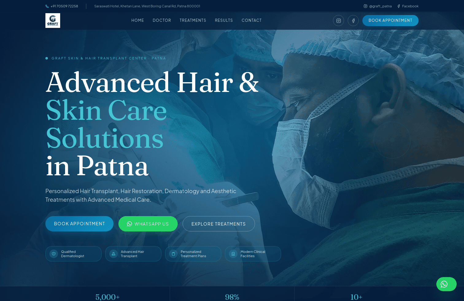
A focused hierarchy helps visitors understand treatments quickly without feeling overwhelmed.
Reusable content patterns keep the experience consistent across languages and screen sizes.
Appointments, WhatsApp and treatment discovery remain visible throughout the experience.
Typography, media and spacing adapt cleanly from large desktop screens to mobile devices.
React components make the interface easier to maintain, extend and reuse.
01. The problem
Visitors need to understand services quickly, trust the clinic and find a clear next action without being buried in information.
02. The solution
The experience combines focused messaging, modular sections, consistent CTA placement and multilingual-ready content architecture.
03. The result
The final product supports service discovery, contact intent and future content growth without sacrificing visual consistency.
Engineering reflection
Challenge
Different text lengths can destabilize layouts, so components and spacing had to remain flexible rather than depend on fixed content.
Learning
Treating the interface as a reusable component system made responsive behavior and future content changes easier to control.
Next iteration
A future iteration would deepen keyboard testing, accessibility validation and performance budgets across key journeys.
Tech stack
Built for real users